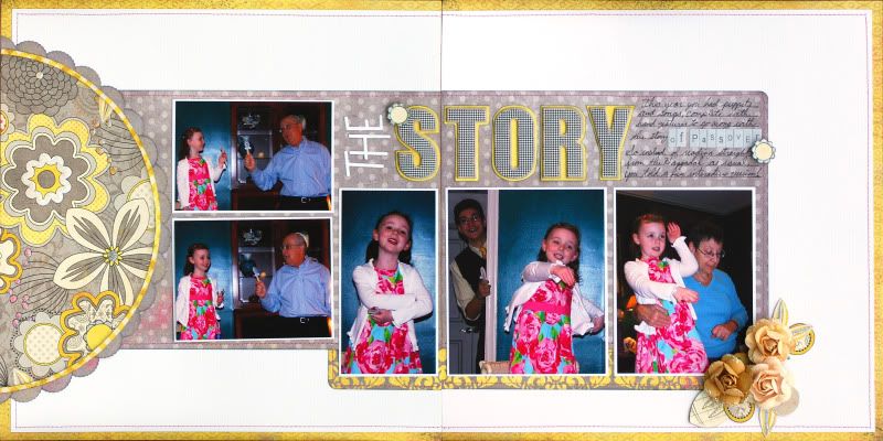
I think most people find double page layouts challenging though. I know I do! so I thought I would share a little about how I create my two page layouts.
I always start by choosing a group of photos where I have several photos that I want to put on one page. Then I look at whether they are vertical or horizontal, or some combination of the two. Then I start sketching!
I can't make a double page layout without a sketch. Working with a premade sketch - like pagemaps - makes things easy, but sometimes it's problematic if you dont have the right photos. So I often make my own sketches.
I usually go for blocks of photos, so I try to arrange the photos in a balanced way, so that not all the vertical and all the horizontal are next to each other. Another thing I often do, is size one of the other, to fit in amongst the others. So for the page below, I resized the horizontal photos, so that two of them together, and a little space in between, ended up being the same size as the verticals.
Once I have found a good configuration for the photos, I think about the rest of the space. I usually try to add something to contrast with the photo block's, well, blockiness. So for the layout below, I added a big circle on one side, and whitespace on the other. Then make room for a title and journaling - sometimes that requires reworking the sketch a little.
Finally, work with the sketch that you have made, just like you would work with a premade sketch - which usually means, some tweaking. Since I planned the sketch around my photos, it usually means less tweaking than using a premade sketch, but this layout is a good example of how some adjustments still need to be made.
I had originally put the two horizontal photos in the middle, but when I laid them out on the papers, I realized that I would have to cut them in half, and there was no good place to cut them that wouldnt totally mess up the photos. so I moved them. Then , I had forgotten a title in my sketch, so I moved the other three down to make room for the title.


2 comments:
I love a good double page.. I have a hard time with it sometimes.. but you sure didn't! :)
You definitely have an awesome double page there!! I love the simplicity but yet impactful!
Post a Comment